Week 5 - Graphic Design
Graphic Design
Today we were working with the graphic design course where we got to experience what Graphics learns. In the morning we were learning about typography and creating titles using a chosen font of our choice. I found this as a weakness as I can't draw very well and typography has the skill of drawing. It took me a couple of attempts after trying different kinds of typography fonts. I finally attempted my chosen font which I enjoyed drawing. I chose to add colour to my font to make it stand out on the page. My typography example is shown below.
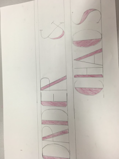 Above is my final version of typography, the line layout was there to help us place the letters on the page, we were told that this was something all graphic students did when they learnt about typography. I liked making typography titles even though I did find it hard I learnt ways to make it much easier for myself and with help from the tutor I did like my piece. Below is the font style I used to create my title Order & Chaos. The reason I chose this font style was because it seemed simple at first, I chose simple because I didn't want to over complicate myself when I find drawing hard already.

Today we were working with the graphic design course where we got to experience what Graphics learns. In the morning we were learning about typography and creating titles using a chosen font of our choice. I found this as a weakness as I can't draw very well and typography has the skill of drawing. It took me a couple of attempts after trying different kinds of typography fonts. I finally attempted my chosen font which I enjoyed drawing. I chose to add colour to my font to make it stand out on the page. My typography example is shown below.


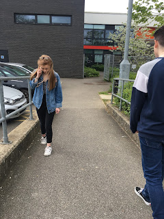
Another task we had to complete was using our photography skills we had to go around college and capture each letter of the alphabet using objects. This was linked with the typography lesson, however instead of drawing typography titles we used our skills in photography and using a Nikon Camera we captured many images showing off our skills we already know. Some examples are shown below. We saved our images on a memory stick and used them in the next graphic lesson on Wednesday.
On Wednesday we were taught by Alan and learnt about the softwares that graphics use. The first software we used was Photoshop where we uploaded our images that we captured in the first graphic lessons. I had to change my images to JPEG files through Photo Shop because my images saved as NEF files. Once saving my images to JPEG I went onto InDesign to create a contact sheet of all my images i captured with my camera. This was the last step we had to complete on InDesign. Overall I did enjoy the graphic carousel from the rest, I learnt a lot of skills and some skills like working with InDesign I already knew how to work the software. This came as a benefit from my last course Media as I was able to get on with the task in hand and not need any help where as some others in the class found InDesign hard to understand.
Comments
Post a Comment